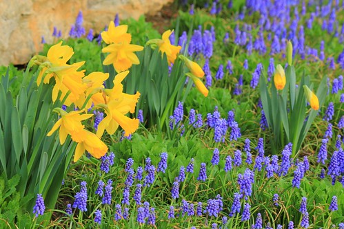
Harbingers of Spring, 2012
© 2012 Susan M. Lohse. All rights reserved.
The complements yellow and purple comprise one of my favorite color combinations. The colors are so intense here because I was experimenting with the saturation setting on my camera.
In most of the photos I took with a high saturation setting, particularly those taken in strong sunlight, contrast was lost as analogous colors blended together. Shot in the shade, this photo was one of the few I thought was a keeper. Now I know just how far I can go with the saturation setting on my camera.
4 comments:
I am always amazed that the pictures I take in the shade turn out so much better. You really captured the color and contrast. Gorgeous photo!
Thanks, Beach Cat!
This is stunning! I don't even know if I have a saturation setting on my camera - maybe I do! I often tweak that a bit in photoshop though. But getting better color in the shade makes sense.
Thanks so much, Ann. You probably do have a saturation setting on your camera, buried in the menu function. I was tweaking color and contrast in image-editing software, too, but was still unsatisfied. I'm trying to get closer to the results I want at the photo-taking level by bumping up contrast and saturation a notch or two. Still experimenting . . .
Post a Comment